Data Visualization With CartoDB
| Author | Steve Matthews |
| Date | January 14, 2015 |
No matter where you live in Vancouver, odds are pretty good there’s a dog nearby with the name Charlie.
How do I know this random tidbit? It’s thanks to CartoDB, a (mostly) free cloud-based mapping tool. While browsing their online gallery, I came across a user-generated map of popular dog names in Vancouver, created using open source data.
The product concept is pretty simple: CartoDB will take geo-location data, along with other connected contextual data, from an Excel spreadsheet or CSV file; and then turn those pieces into an professional-looking, interactive map.
We recently used CartoDB for a client project at Stem, where we plotted reports of medical device problems (metal hip replacements) on a map of the United States. The map showed which devices were implanted, where, and what symptoms were reported. While the data set was admittedly simple, with the finished product we were able to demonstrate the geographic spread of the problem at hand.
The map creation process wasn’t difficult – at least with our KISS-level usage of the product. The work was conducted in three phases: data importing (selecting the CSV or XLS file from the local computer); georeferencing the data (a simple tool, converting addresses or “City...
To continue reading
Request your trialSubscribers can access the reported version of this case.
You can sign up for a trial and make the most of our service including these benefits.
Why Sign-up to vLex?
-
Over 100 Countries
Search over 120 million documents from over 100 countries including primary and secondary collections of legislation, case law, regulations, practical law, news, forms and contracts, books, journals, and more.
-
Thousands of Data Sources
Updated daily, vLex brings together legal information from over 750 publishing partners, providing access to over 2,500 legal and news sources from the world’s leading publishers.
-
Find What You Need, Quickly
Advanced A.I. technology developed exclusively by vLex editorially enriches legal information to make it accessible, with instant translation into 14 languages for enhanced discoverability and comparative research.
-
Over 2 million registered users
Founded over 20 years ago, vLex provides a first-class and comprehensive service for lawyers, law firms, government departments, and law schools around the world.
Subscribers are able to see a list of all the cited cases and legislation of a document.
You can sign up for a trial and make the most of our service including these benefits.
Why Sign-up to vLex?
-
Over 100 Countries
Search over 120 million documents from over 100 countries including primary and secondary collections of legislation, case law, regulations, practical law, news, forms and contracts, books, journals, and more.
-
Thousands of Data Sources
Updated daily, vLex brings together legal information from over 750 publishing partners, providing access to over 2,500 legal and news sources from the world’s leading publishers.
-
Find What You Need, Quickly
Advanced A.I. technology developed exclusively by vLex editorially enriches legal information to make it accessible, with instant translation into 14 languages for enhanced discoverability and comparative research.
-
Over 2 million registered users
Founded over 20 years ago, vLex provides a first-class and comprehensive service for lawyers, law firms, government departments, and law schools around the world.
Subscribers are able to see a list of all the documents that have cited the case.
You can sign up for a trial and make the most of our service including these benefits.
Why Sign-up to vLex?
-
Over 100 Countries
Search over 120 million documents from over 100 countries including primary and secondary collections of legislation, case law, regulations, practical law, news, forms and contracts, books, journals, and more.
-
Thousands of Data Sources
Updated daily, vLex brings together legal information from over 750 publishing partners, providing access to over 2,500 legal and news sources from the world’s leading publishers.
-
Find What You Need, Quickly
Advanced A.I. technology developed exclusively by vLex editorially enriches legal information to make it accessible, with instant translation into 14 languages for enhanced discoverability and comparative research.
-
Over 2 million registered users
Founded over 20 years ago, vLex provides a first-class and comprehensive service for lawyers, law firms, government departments, and law schools around the world.
Subscribers are able to see the revised versions of legislation with amendments.
You can sign up for a trial and make the most of our service including these benefits.
Why Sign-up to vLex?
-
Over 100 Countries
Search over 120 million documents from over 100 countries including primary and secondary collections of legislation, case law, regulations, practical law, news, forms and contracts, books, journals, and more.
-
Thousands of Data Sources
Updated daily, vLex brings together legal information from over 750 publishing partners, providing access to over 2,500 legal and news sources from the world’s leading publishers.
-
Find What You Need, Quickly
Advanced A.I. technology developed exclusively by vLex editorially enriches legal information to make it accessible, with instant translation into 14 languages for enhanced discoverability and comparative research.
-
Over 2 million registered users
Founded over 20 years ago, vLex provides a first-class and comprehensive service for lawyers, law firms, government departments, and law schools around the world.
Subscribers are able to see any amendments made to the case.
You can sign up for a trial and make the most of our service including these benefits.
Why Sign-up to vLex?
-
Over 100 Countries
Search over 120 million documents from over 100 countries including primary and secondary collections of legislation, case law, regulations, practical law, news, forms and contracts, books, journals, and more.
-
Thousands of Data Sources
Updated daily, vLex brings together legal information from over 750 publishing partners, providing access to over 2,500 legal and news sources from the world’s leading publishers.
-
Find What You Need, Quickly
Advanced A.I. technology developed exclusively by vLex editorially enriches legal information to make it accessible, with instant translation into 14 languages for enhanced discoverability and comparative research.
-
Over 2 million registered users
Founded over 20 years ago, vLex provides a first-class and comprehensive service for lawyers, law firms, government departments, and law schools around the world.
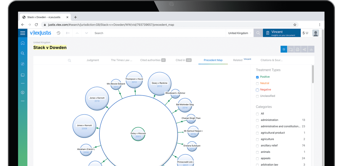
Subscribers are able to see a visualisation of a case and its relationships to other cases. An alternative to lists of cases, the Precedent Map makes it easier to establish which ones may be of most relevance to your research and prioritise further reading. You also get a useful overview of how the case was received.
Why Sign-up to vLex?
-
Over 100 Countries
Search over 120 million documents from over 100 countries including primary and secondary collections of legislation, case law, regulations, practical law, news, forms and contracts, books, journals, and more.
-
Thousands of Data Sources
Updated daily, vLex brings together legal information from over 750 publishing partners, providing access to over 2,500 legal and news sources from the world’s leading publishers.
-
Find What You Need, Quickly
Advanced A.I. technology developed exclusively by vLex editorially enriches legal information to make it accessible, with instant translation into 14 languages for enhanced discoverability and comparative research.
-
Over 2 million registered users
Founded over 20 years ago, vLex provides a first-class and comprehensive service for lawyers, law firms, government departments, and law schools around the world.
Subscribers are able to see the list of results connected to your document through the topics and citations Vincent found.
You can sign up for a trial and make the most of our service including these benefits.
Why Sign-up to vLex?
-
Over 100 Countries
Search over 120 million documents from over 100 countries including primary and secondary collections of legislation, case law, regulations, practical law, news, forms and contracts, books, journals, and more.
-
Thousands of Data Sources
Updated daily, vLex brings together legal information from over 750 publishing partners, providing access to over 2,500 legal and news sources from the world’s leading publishers.
-
Find What You Need, Quickly
Advanced A.I. technology developed exclusively by vLex editorially enriches legal information to make it accessible, with instant translation into 14 languages for enhanced discoverability and comparative research.
-
Over 2 million registered users
Founded over 20 years ago, vLex provides a first-class and comprehensive service for lawyers, law firms, government departments, and law schools around the world.